Page 1 of 1
Juggernaut

Posted:
Fri Apr 21, 2006 11:39 amby oO SioS Oo
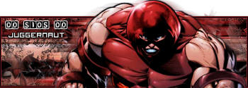
hey people i just came up with these

hope you like as its my first with transparency

please rate and comments etc..
ope you like

Posted:
Fri Apr 21, 2006 11:46 amby .Vault
u did a nice job with the transparency's and all... 9/10
still having the small text problem
and it seems as if the top of the juggernauts head in the sig is motion burred... it kinds makes it look bad with the transparency backround
Posted:
Fri Apr 21, 2006 11:50 amby Supashay91
10/10 I see nothing wrong...
Posted:
Fri Apr 21, 2006 12:55 pmby oO SioS Oo
thanks for the comments
the whole Juggernaut has 3 diff types of blur on
glad you like it though i just thought id try something new
i dont see nothing wrong with the text this time round ...
Posted:
Fri Apr 21, 2006 1:44 pmby bronxbomber92
i think i have seen this before! lol, grea sig anyways!
Posted:
Sat Apr 22, 2006 9:13 pmby . Jachson
Signature:
It looks Ok, but I think the blending could use some work, same with the brushing use, and the font needs some tutorials looked up on it, it is just too plain, pop-up idea is Ok in ways, but you forgot to cut off a piece of something on the right side. Border could be better.
Avitar:
Plain and simple, nothing to say about it really.
Signature Overall Rating - 7/10
Avitar Overall Rating - 4/5
Posted:
Sun Apr 23, 2006 3:34 amby oO SioS Oo
yeah thanks m8 i know i forgot something but windows is crap and cant see transparency so i couldnt see that i had left it on when i was creating it
thanks
Posted:
Sun Apr 23, 2006 5:11 amby Maikeru-
sig: 7/10 - i dnt like the render but its ok its abit dark but thats my opionion
avatar: 5/5 nothin wrong with it